Notes From Media Day
August 17, 2011 – | No Comment

Before I begin, I should probably explain why we haven’t posted in a while. Frankly, it’s just been bad timing. I just got back from a study abroad program in Europe, and Charlie is still …

Read the full story »

Beaver Stadium Scoreboard Changes

Submitted by on September 18, 200914 Comments

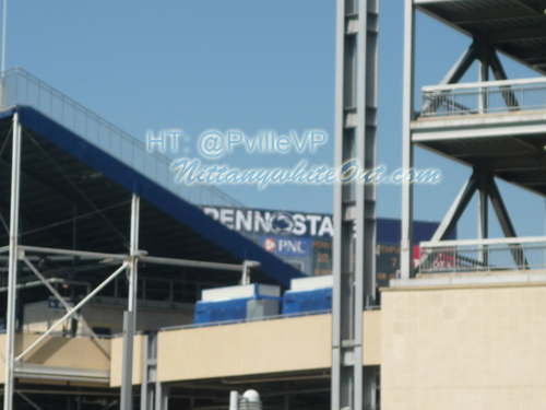
There were rumors about a new change to the scoreboard lettering, and thanks to @PvilleVP, we have a picture of it right here. Frankly this is an upgrade from the old tennis ball font Penn State had. Now it reflects the lettering in the end zones.

top related stories
you may also like

  • Mitch Tanner

    I like the Lion logo in between Penn State.

  • @NationBuilder

    @PvilleVP Sorry man, still not a fan of that wordmark

  • @PvilleVP

    @NationBuilder Well the logo adds a lot more than just the words, which is what we thought it was originally. I'm okay with it.

  • @NationBuilder

    @PvilleVP But now the logo is off-center (“PENN” and “STATE” are not the same width) and the two words visually run together into one

  • @NationBuilder

    @PvilleVP It's just poor execution of graphic design. It even violated the university's style manual http://tinyurl.com/kmegkj

  • @PvilleVP

    @NationBuilder Haha you would be the one to find that. I like the tennis ball letters with Penn on top of State though that looks cool

  • @NationBuilder

    @PvilleVP This is how I would've done it http://tinypic.com/view.php?pic=2hs0soi&s=4